Color is one of the most powerful tools in home decor, and one of the most intimidating. Walk into any paint store in the Philippines and you are faced with hundreds of swatches, each subtly different, each promising to transform your room. Without a basic understanding of how colors relate to each other, choosing feels like guesswork.
But once you understand how the color wheel works, the mystery disappears. Choosing a palette for any room becomes a matter of following simple, proven relationships between colors. This guide breaks down color theory into practical terms that any Filipino homeowner can apply immediately.
The Color Wheel, Simplified
The color wheel is a circular diagram that organizes colors by their relationship to each other. At its core, it includes three categories: primary colors (red, blue, yellow) that cannot be created by mixing other colors; secondary colors (green, orange, purple) made by mixing two primaries and tertiary colors – the shades in between, like red-orange or blue-green.
Understanding these relationships is the key to picking colors that naturally look good together. You do not need to memorize color theory, you just need to know three simple color schemes and when to use them.
Three Easy Color Schemes to Try
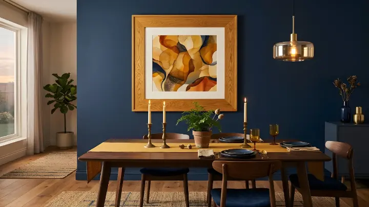
Complementary colors sit opposite each other on the wheel – like blue and orange, or red and green. They create bold, energetic contrast that makes both colors pop. This scheme works beautifully for accent walls, statement wall art and rooms where you want visual energy. A calm blue room with a bold orange-toned art piece above the sofa immediately feels more dynamic and intentional.
Analogous colors sit next to each other on the wheel – like blue, teal and green. They naturally harmonize because they share underlying tones. This scheme produces calm, cohesive looks that are ideal for bedrooms, reading nooks and any space where you want to feel relaxed. Many Filipino homeowners instinctively gravitate toward analogous schemes without realizing it – earth tones like beige, terracotta and warm brown are analogous neighbors on the wheel.
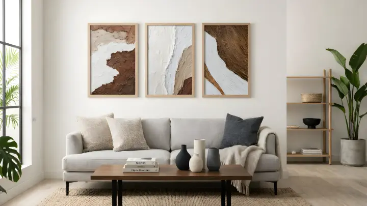
Monochromatic schemes use different shades, tints and tones of a single color. Think varying depths of gray from almost white to charcoal or different intensities of blue from powder to navy. This approach feels sophisticated and is almost impossible to get wrong. It is particularly effective in small Philippine condos where too many colors can feel chaotic and overwhelming.
The Power of Neutrals in Philippine Homes
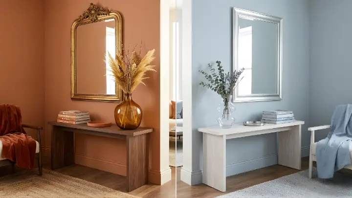
Neutrals – white, beige, gray, black and earth tones – are the backbone of most well-designed Filipino rooms. They act as a canvas, that allows your furniture, wall art and accent pieces to stand out. The Philippine preference for warm neutrals like cream, sand and light wood tones is well-suited to our tropical lifestyle – these colors feel natural, airy and welcoming.
A neutral wall paired with a bold piece of wall art or a statement mirror creates maximum impact without overwhelming the space. This is the principle behind the 60-30-10 rule: your dominant neutral creates calm (60%), your secondary color adds personality through textiles and larger accents (30%) and your accent pieces such as frames, vase, clocks, table decor – provide the final punch of energy (10%).
How to Apply This in Your Home, Room by Room
Start by identifying one color you love. Find it on the color wheel, then choose your scheme – complementary for energy, analogous for calm, monochromatic for sophistication. Then apply the 60-30-10 rule to distribute those colors across your room.
In a living room, your dominant color goes on walls and the sofa. Your secondary appears in curtains, a rug and throw pillows. Your accent color shows up in wall art, decorative frames, a clock and table accents. In a bedroom, keep the dominant and secondary colors soft and calming, then let your accent introduce a quiet pop of contrast.
Test Before You Commit
Before painting an entire wall or buying a full set of coordinated decor, test your palette with smaller items first. Buy one accent piece in your chosen color and live with it for a week. See how it looks in your actual lighting at different times of day – Philippine sunlight in the morning is very different from the warm glow of evening artificial light.
Paint swatches on the wall are helpful, but physical objects give you a much better sense of how your chosen palette will actually feel in the room. If the test piece feels right, build out from there. If it does not, you have saved yourself the cost of an entire room makeover in the wrong palette.
Find wall art, frames and accent pieces in a range of styles and tones at our shop and bring your perfect color palette to life in every room.
People Also Ask
Monochromatic, using different shades of a single color. It is nearly impossible to get wrong and creates a sophisticated, cohesive look. Start with varying tones of gray, blue or beige and build from there.
Use light, neutral tones as your dominant color to make the room feel open and airy. Then add one or two accent colors through wall art and small decor pieces. Avoid using more than three colors in a compact space.
A formula for distributing color: 60% dominant color (walls, large furniture), 30% secondary (textiles, rugs, curtains) and 10% accent (wall art, frames, small decor). This ratio creates visual balance in any room.
Both can work, but warm tones tend to feel natural and welcoming in the Philippine tropical climate. Cool tones like blue and teal work well in bedrooms and bathrooms where a calming effect is desired.